If you grew up playing Red Light, Green Light, you already understood one of the most effective forms of data visualization before you ever heard the term “data visualization.”
🟢 Green meant GO.
🔴 Red meant STOP.
That was it. No manual. No training session. No dashboard legend. If you twitched after someone yelled “Red light!” there was always at least one kid who was VERY enthusiastic about calling you out. 😂
What I love about the game is just how universal the idea is. We see red and green and our brains immediately attach meaning to them:
Red means something is wrong, stopped, or needs attention.
Green means things are good. Keep going.
That same simplicity is something we think about a lot with DataCaster.
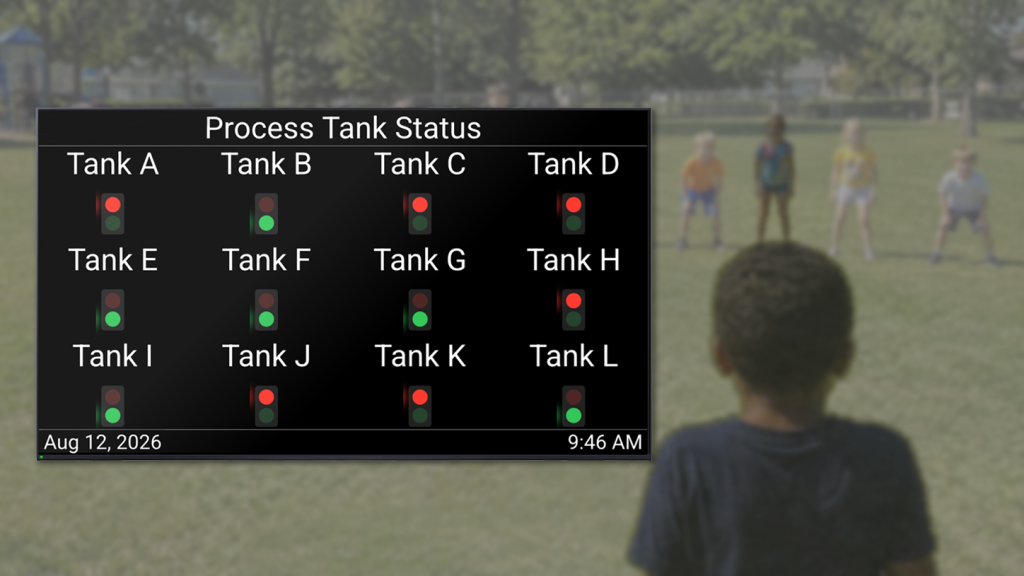
Manufacturing plants already have enormous amounts of data. The challenge isn’t always getting more data. Sometimes the challenge is making the data instantly understandable.
If a machine is running, show me green.
If something needs attention, show me red.
Don’t make someone stop, read three numbers, remember a target, do some mental math, and then decide whether there’s a problem. Give them the context immediately.
Sometimes, the best user interface isn’t the most sophisticated one. Often, it’s something you understood when you were eight years old:
🟢 Go.
🔴 Stop.
Funny how some of the best ideas stick with us.